
One
Health
First Point Community Web Redesign | Chicago
jun 15-aug 14, 2026
During my UX design internship at One.Health Partners, I redesigned First Point Community’s six-page website around key visitor tasks: exploring services, finding clinics, booking appointments, and donating. My work included a site audit, competitive analysis, information architecture, a reusable design system, and high-fidelity screens.
-
My Role: UX Design Intern
-
Scope: Site audit, competitive analysis, information architecture, visual design, components, and high-fidelity screens
-
Tools: Figma, Claude Code


Understanding What to change
First Point Community had more than 40 years of community impact, but its website did not fully reflect that credibility. I audited seven areas of the site and compared five peer organizations, identifying more than 30 potential improvements.
The findings shaped a clearer navigation structure and reusable components for services, clinic information, appointments, and donations.
Design System and IA
The site audit revealed opportunities to make services, clinic locations, appointment information, and donations easier to find. I reorganized the navigation around these tasks, creating dedicated paths for About Us, Services, Find Us, Book Appointment, and Donate.
Stakeholders provided the colors, typography, sizing, and iconography that guided the redesign. Within those requirements, I developed page layouts and reusable components, using hierarchy and spacing to organize the content. Stakeholder feedback helped me refine these choices to reflect the client’s vision while supporting key visitor tasks.


Design Evolution
Across several iterations, I explored how to balance First Point’s existing brand with clearer navigation and a warmer visual identity. The three directions below show how the homepage evolved through design exploration and stakeholder feedback.
My first direction focused on making First Point feel modern and credible. I explored a darker palette, expressive gradients, and prominent calls to action.
The direction brought energy to the site, but it felt too much like a technology startup. I needed a visual approach that better reflected the warmth of a community healthcare organization.
Version 1
My first direction focused on making First Point feel modern and credible. I explored a darker palette, expressive gradients, and prominent calls to action. I explored how to apply the prescribed visual system through a darker layout, expressive gradients, and prominent calls to action.
The direction brought energy to the site, but it felt too much like a technology startup. I needed a visual approach that better reflected the warmth of a community healthcare organization.


Version 2
I moved toward a lighter, more restrained layout, reducing visual complexity and giving the content more space.
This direction made the page easier to scan, but it felt too minimal and cold. It helped clarify the structure, while showing me that simplicity alone would not communicate First Point’s personality.

Version 3
Stakeholder feedback helped me bring the clearer structure together with a warmer visual identity. The final direction paired navy and cream with bright accents, people-centered photography, and reusable components.
I carried this approach across six pages: Home, About, Services, Find Us, Book Appointment, and Donate. The resulting design gave each visitor path a consistent structure while preserving First Point’s community focus.
Bringing It all together
At the end of my internship, I presented the final redesign that spans six pages, connected by shared navigation, typography, and components, to key stakeholders. Each page supports a distinct visitor task—from exploring services and locating a clinic to requesting an appointment or making a donation.
Try it yourself
More from my internship
Alongside my First Point Community capstone, I worked on branding, login interfaces, and social media designs across the One.Health ecosystem.
Atlantis and Odyssey Logo Exploration
I explored 10-15 logo variations for both Atlantis and Odyssey, refining typography, symbols, and brand lockups to give each platform a distinct identity while maintaining its connection to One.Health.

Atlantis and Odyssey SSO Login Screens
I designed 35+ login-screen iterations, exploring imagery, visual hierarchy, and form placement. The selected direction brought both healthcare platforms into a shared login experience with a dark, vibrant visual treatment.

Final:

Blue swan pharmacy instagram templates
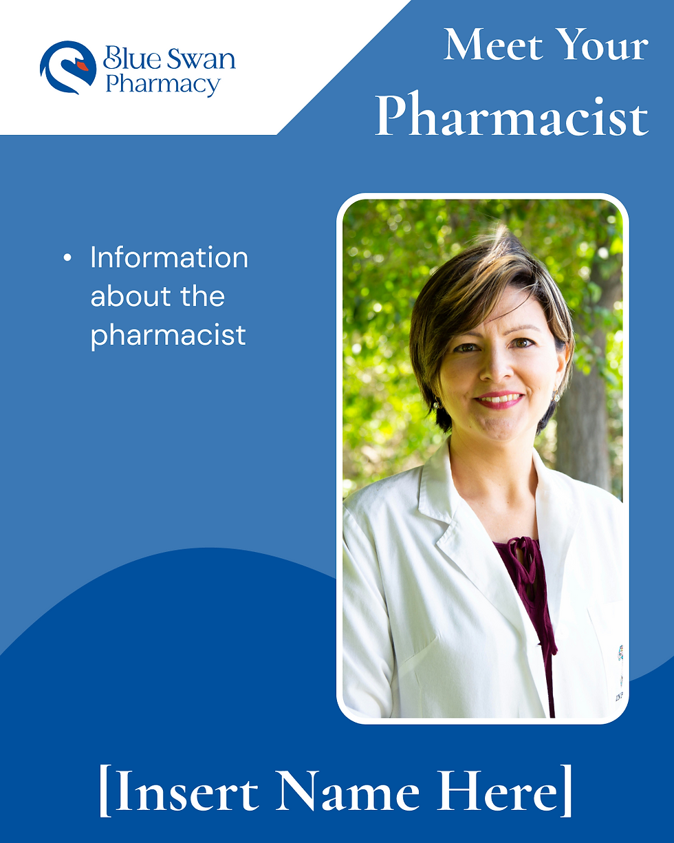
Working with social media intern Dana Kamal, I created reusable Instagram templates for a six-month content strategy. The designs supported pharmacist introductions, community outreach, and patient education while maintaining a consistent Blue Swan identity.

Key takeaways
real users ≠ hypothetical Users
Constraints are the job
I designed for someone experiencing homelessness. Every word mattered. This pushed me to think more carefully about how language and navigation could help someone find care during a difficult moment.
HIPAA, brand guidelines, stakeholder opinions — that’s UX in the real world. I learned to treat these constraints as inputs that shaped my design decisions throughout the process.
Designing within a shared vision
Iteration is not failure
Stakeholder feedback challenged me to work beyond my own visual preferences. I learned to explain my design decisions and refine them within the client’s established brand and vision.
35+ login screens. 5 homepage versions. Every one got us closer. Exploring different directions helped me clarify what each design needed to communicate and which choices supported that goal.
