
kaizen
24-hour design-a-thon | University of florida
feb 28-mar 1, 2026
A career companion app designed to help students navigate the uncertainty between applying to internships and hearing back.
-
My Role: UX Design Lead
-
Timeline: 24 hours
-
Context: Design-A-Thon Project
-
Tools: Figma

The Problem
Students experience a lack of control during the internship application process, especially in the period between submitting applications and receiving responses. This “in-between” creates anxiety, uncertainty, and a loss of motivation.
knowing the user
Students feel stuck after applying
"I've applied to so many and most of the time I don't get a response"
Progress feels invisible
"Oversaturation: so many people applying for the same position"
"Too much demand, not enough supply"
Opportunity
How can we help students take back their sense of control and progress during this internship "in-between"?
The
Kaizen is a career companion app that encourages users to complete one meaningful action per day, helping them build momentum and reduce anxiety through visible progress.
Solution
Design System

I created a color palette that reflects the calming nature of the app's purpose, as well as a simple, rounded, sans-serif font
Core features


-
Calendar checkmarks
-
Reinforces momentum
Users complete one small task per day
Builds a streak → reinforces consistency
-
-
-
-
Design process
Initially, I explored multiple ways to track progress, including task lists and progress bars. Though I did not have time to iterate these possibilities due to the time limit constraints of the design-a-thon, based on my research, I shifted toward a calendar-based system because it made progress feel more tangible and consistent.
Key Takeaways
Working within a 24-hour timeframe forced me to prioritize clarity and purpose, focusing on a single core behavior rather than overloading the product with features.
If I had more time, I would conduct usability testing to validate the effectiveness of the daily task system.

Nivan
UX DESIGN CONFERENCE | Illinois institute of technology
May 21, 2026
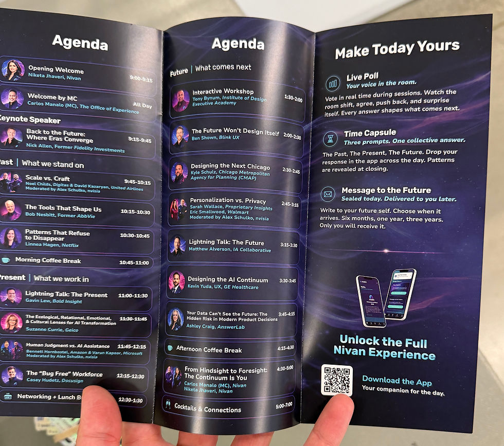
I designed the trifold pamphlet for Nivan’s inaugural conference, taking it from wireframes to a finished piece printed and distributed to all attendees on May 21, 2026.
-
My Role: UX Designer
-
Context: Design Conference Pamphlet
-
Timeline: Approximately one month
-
Tools: Figma


The challenge
The pamphlet needed to bring a full day of sessions, speaker information, sponsors, and interactive activities into a limited physical space. The challenge was to make this information easy to scan while reflecting Nivan’s identity and its theme of past, present, and future.

The structure
I began with wireframes to plan how information would be distributed across the six panels. This established space for the agenda, conference introduction, sponsors, and app access before developing the visual treatment.

(Note: I found that in order for the layout to work for print I had to reverse it, which is why the final has the order reversed)

Scannability
The final agenda uses a consistent layout for session titles, speakers, and times, with sections organized around the conference’s past, present, and future themes. Speaker portraits and contrasting text treatments distinguish different types of information within the dense schedule.

From Print to Digital
Beyond the schedule, the pamphlet introduced live polls, the Time Capsule, and Message to the Future. A dedicated app panel paired a QR code with a clear call to action, connecting the printed guide to the conference’s digital experience.

The outcome
The finished pamphlet was printed and distributed to all attendees at Nivan’s first conference. It brought the schedule, participation opportunities, and conference identity together in a single guide attendees could carry throughout the day.

Key takeaways
This project showed me how information hierarchy shapes an experience beyond a screen. Working within a folded print format meant considering both the overall composition and how each panel could communicate on its own.
